GPHG
Brand Identity Pitch
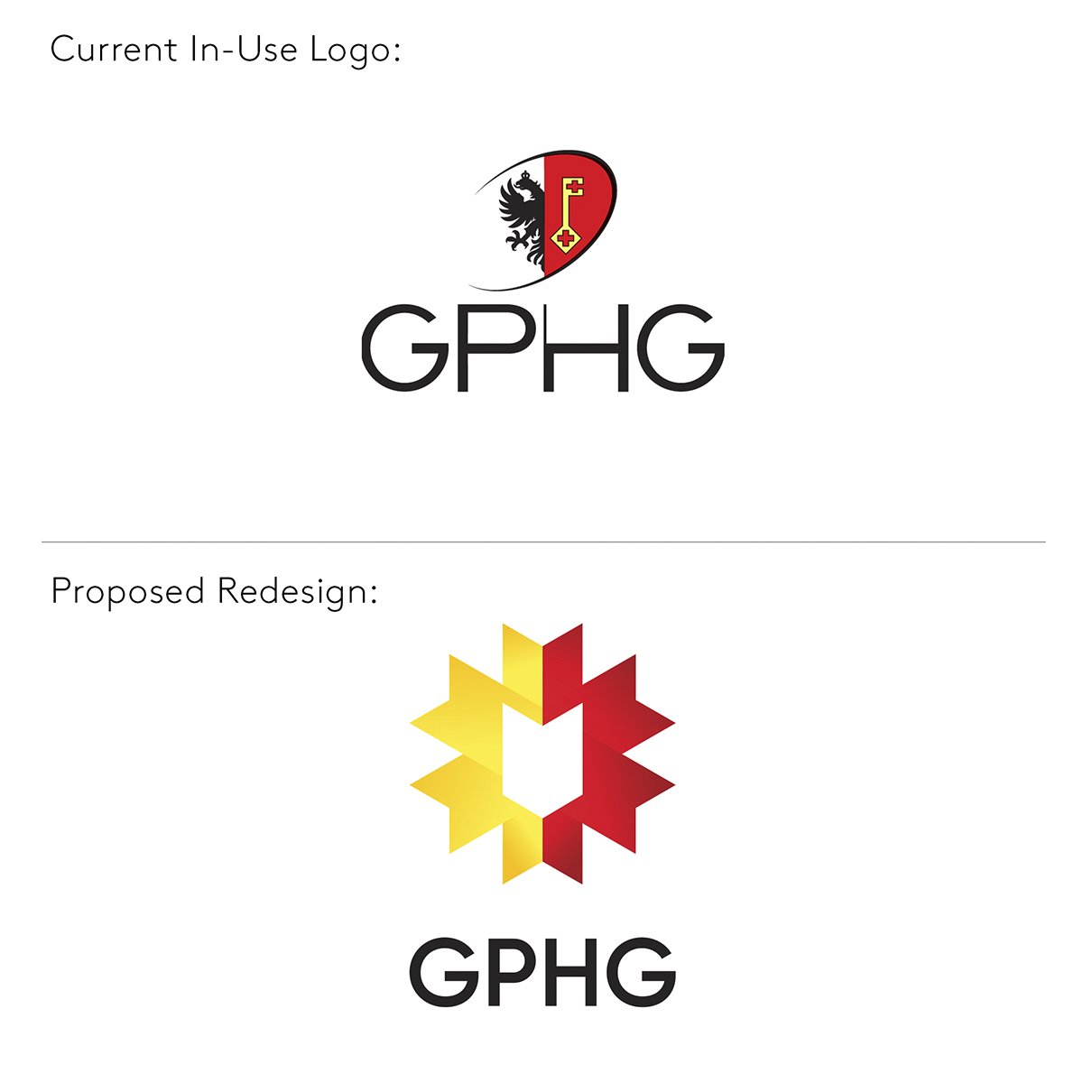
We pitched a new brand identity to the Grand Prix d’Horlogerie de Genève. As unsolicited as our advice may have been, it was a passion project we felt the need to see through. Our new logo respects its origins and the GPHG's principles. The colours are based on the Geneva Coat of Arms, and the twelve points symbolize the GPHG's categories.
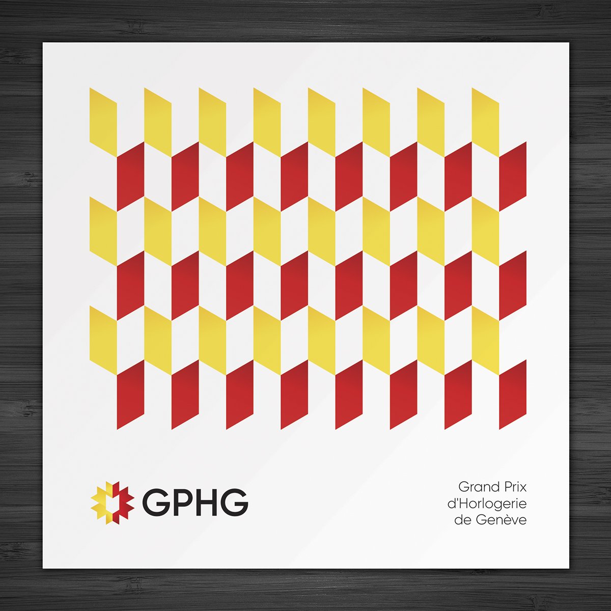
We felt the current GPHG brand relies too much on the Geneva Seal and Coat of Arms. Our redesign aims for a more distinct identity. It's versatile too, with simple geometric elements that can be used for patterns or framing imagery.


